Bookmarks started with a small frustration: saving something from the web still feels heavier than it should.
Most bookmarking tools drift to one of two extremes. They are either too minimal to be useful after a week, or they become so overloaded with features that capturing a simple link feels like administration. I wanted something quieter than that. Fast to save into, easy to revisit, and structured enough to stay useful over time.
Simple bookmarking for everyone.
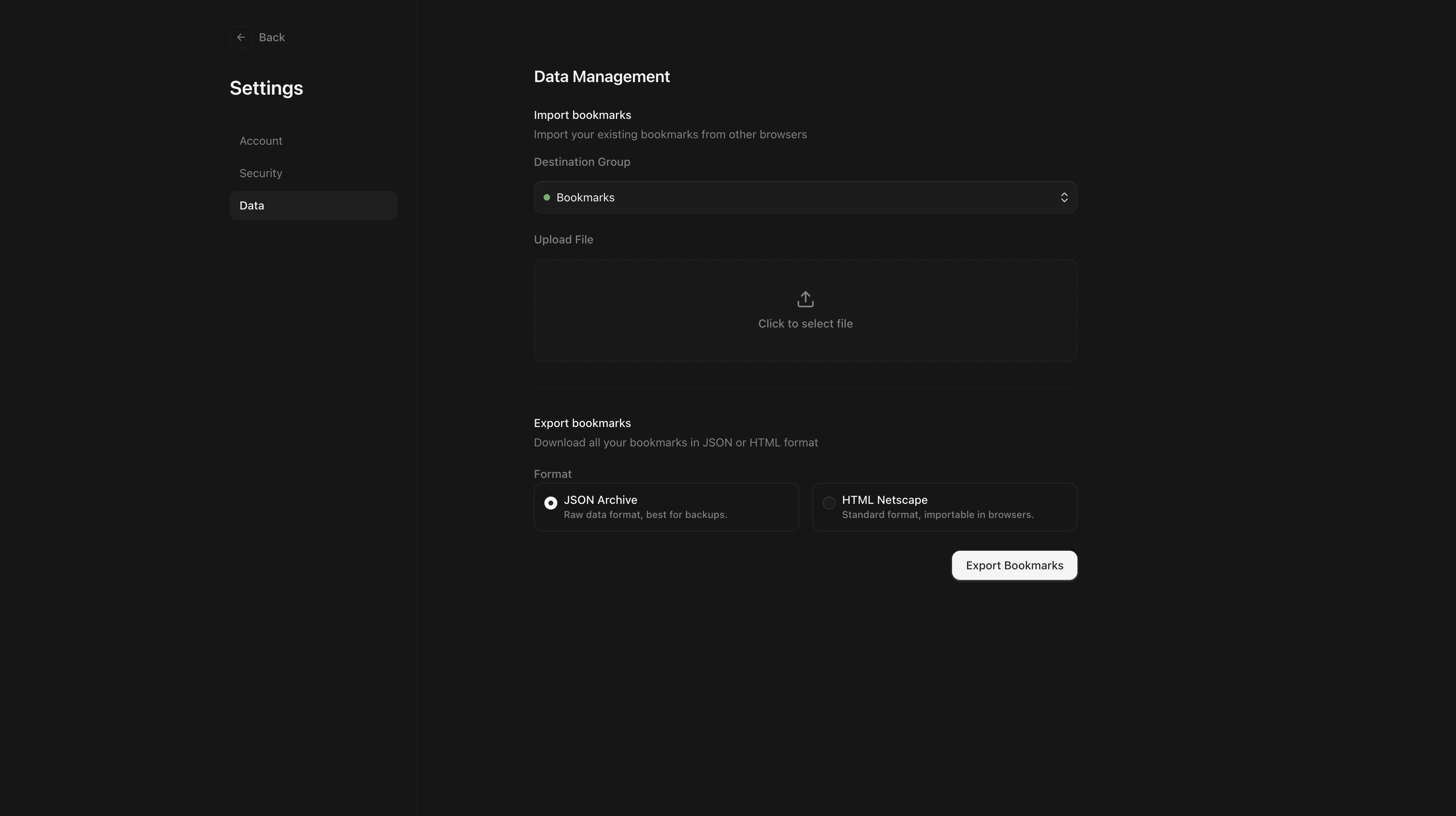
That line from the README is deliberately modest. In practice, the project became a full personal bookmarking system with authentication, groups, tags, metadata enrichment, multiple item types, optimistic updates, and drag-and-drop organization.
A Bookmark Manager That Behaves More Like a Library
Bookmarks looks simple from the outside, but its structure is closer to a small personal library than a plain list of URLs.
The core model is built around a few ideas:
- groups for broad organization
- tags for flexible categorization
- metadata to make saved items recognizable
- pinning and reordering to keep important things close
- search for retrieval
- multiple bookmark types, not just links
That last point matters. The app supports links, text notes, and color swatches. This pushes the product away from being a bucket of raw URLs and toward being a place for collecting references with a bit more context.
Two Modes, One Product
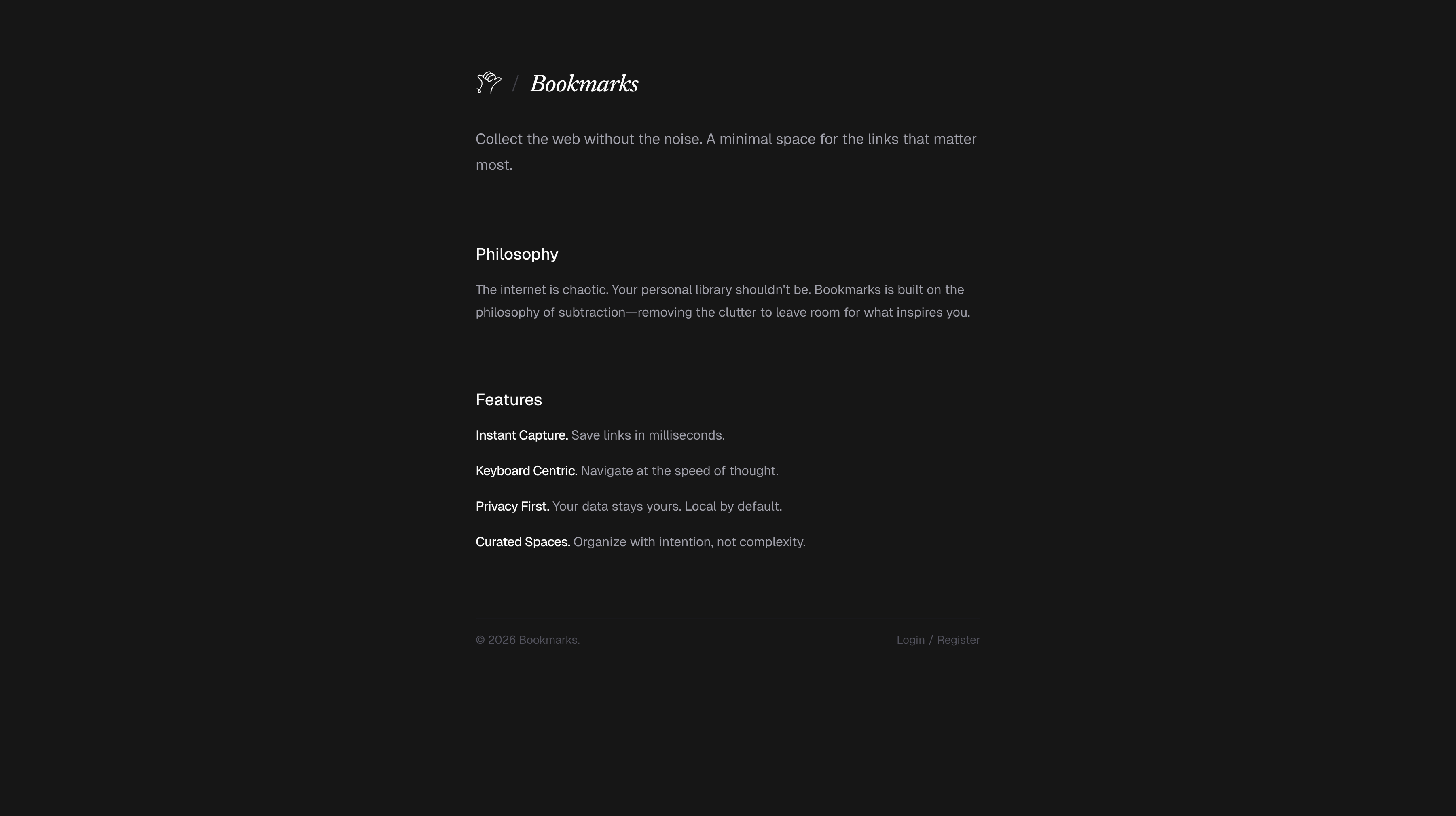
One of the cleaner decisions in the project is the split between public and authenticated states.
If the user is not signed in, the app shows a proper landing page instead of dropping them into an empty shell. It explains the product clearly: collect the web without the noise, organize intentionally, and move quickly.
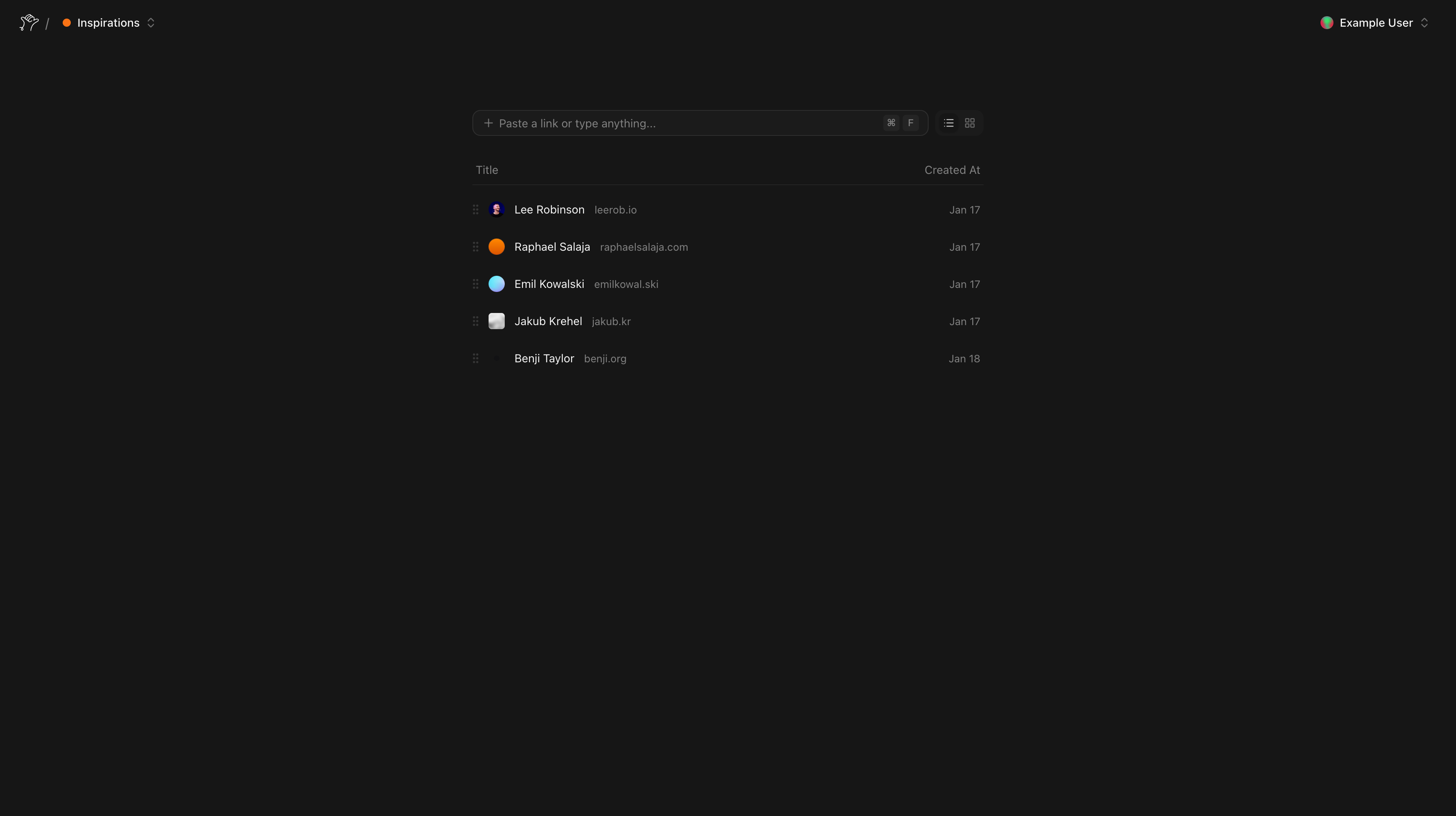
Once authenticated, the experience becomes a working dashboard. Groups are fetched server-side, bookmarks are loaded into the active workspace, and that initial state is handed off to a rich client UI that can create, reorder, update, and search without feeling sluggish.
That separation keeps the product honest. The public side communicates what the tool is for. The private side focuses entirely on doing the job well.
Capture Is the Most Important Interaction
The value of a bookmarking app is decided in the first few seconds after a user pastes a URL.
Bookmarks treats that flow as the center of the product. When a link is saved, the URL is normalized, metadata is fetched on the server, titles and favicons are extracted, tags are connect-or-created, and the bookmark is appended into the correct group with the correct ordering.
That means the saved result is immediately legible. Instead of forcing the user to clean up later, the app tries to return a recognizable object right away.
This is also where the product starts feeling more thoughtful than generic. A bookmark is not just stored. It is prepared for future retrieval.
Metadata, But With Restraint
The metadata layer is one of the project’s strongest details because it is useful without being careless.
The server-side fetcher blocks unsafe internal targets, rejects private-network addresses, uses timeouts, and then attempts to extract values in a sensible order: og:title, document title, explicit favicon links, and finally /favicon.ico as a fallback.
This does two things at once. It improves the user experience, because recognizable bookmarks are easier to scan. And it keeps the implementation disciplined, because arbitrary URL fetching needs guardrails if it is going to be part of a real product.
Onboarding Without Dead Ends
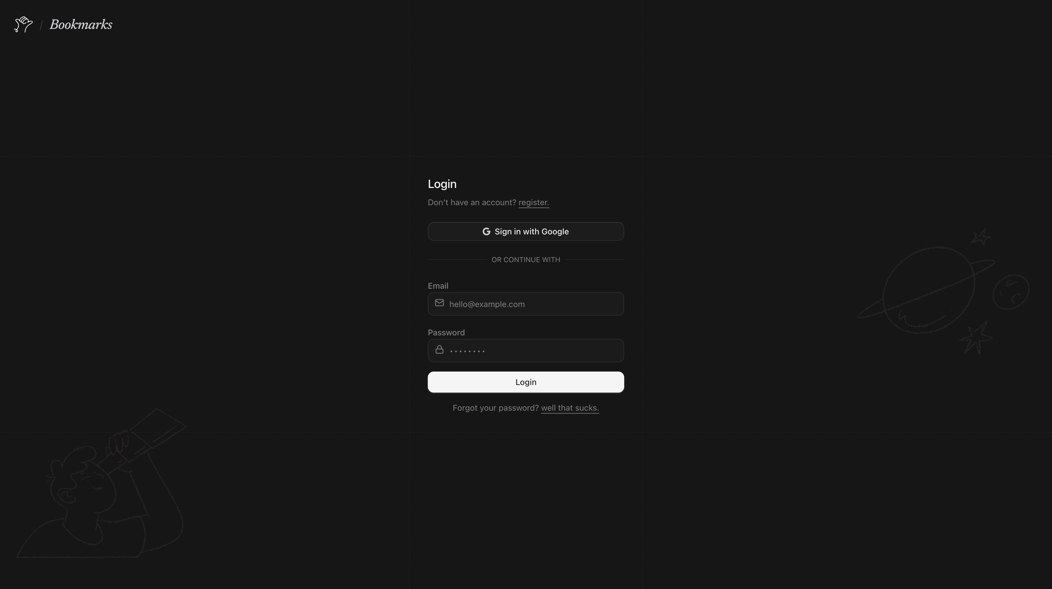
Authentication is handled with Better Auth, but the more interesting part is how the app uses it to make the workspace feel ready immediately.
The project supports email and password, password reset, optional Google OAuth, and account linking. But the nicest detail happens after login: if a user does not yet have a group, the app creates a default one automatically.
That small decision removes the empty-state awkwardness that many tools have on first launch. The user signs in and already has a place to start.
Fast Because the Client Is Allowed to Feel Direct
The dashboard relies on TanStack Query and optimistic mutations to keep the UI immediate.
New bookmarks appear before the roundtrip finishes. Reordering feels local instead of remote. Updates can roll back when necessary, but most of the time the interface behaves as if the product is already in sync with the user’s intent.
This is where the project gains a lot of its polish. The point is not to make the frontend look advanced. The point is to make the act of organizing feel direct.
There is also more local state than first appears: active group, search query, selection, hover, rename state, and view mode all combine into a dashboard that behaves more like an application than a static page.
Structure as a First-Class Feature
A lot of bookmarking apps technically support organization, but the organization layer feels added on after the fact.
Here, groups and tags are central to the product model. Groups can be created, renamed, recolored, deleted, and reordered. Bookmarks can be moved, pinned, refreshed, tagged, and sorted. Even the delete interaction for groups has its own deliberate press-and-hold treatment.
That matters because it supports two very different user behaviors at once: quick capture now, careful curation later.
The Stack Fits the Product
The technical choices are modern, but more importantly, they are well matched to the product:
- Next.js App Router for UI and server rendering
- Prisma + PostgreSQL for persistence
- Better Auth for authentication
- ORPC for typed procedures
- TanStack Query for optimistic client updates
- dnd-kit for drag-and-drop organization
The backend shape is also clean. Instead of a vague collection of endpoints, operations are organized around the actual verbs of the app: create, update, reorder, move, refresh, delete.
Why It Feels Worth Continuing
Bookmarks already stands on its own, but it also leaves room for a larger future.
Because the foundations are solid, the product could naturally grow into richer note-taking, browser extension capture, archive and reading modes, smarter collections, or even semantic retrieval later on. None of that feels forced, because the current data model already supports a lot more depth than the UI initially suggests.
Closing Thoughts
Bookmarks is interesting to me because it takes a modest idea seriously.
It is still a bookmark manager. But it is one that cares about the quality of capture, the clarity of retrieval, the shape of organization, and the feeling of the interface in between. That combination is what lifts it above being just another place to dump links.
If I had to summarize it in one sentence, it would be this:
Bookmarks is a calm, metadata-rich bookmarking tool designed to make saving, organizing, and revisiting the web feel fast and intentional.
That is the version of the idea I wanted from the start.